
In 2020, Coindee Company had a vision to release products related to cryptocurrency trading to the investment market. This was due to recognizing the increasing value of trading assets among investors following the meteoric rise of Bitcoin during that period, reaching a price of 1,200,000 baht.
During that time in Thailand, the cryptocurrency sector was still relatively niche, and many novice investors encountered difficulties in using or learning about trading. This led to frustrations and headaches in the learning process.
These problems led to research efforts aimed at addressing and redesigning products to be more user-friendly and improve the quality of life for users. The goal was to gather data related to the behavior, usage patterns, and knowledge of investors who sought to generate income.
I began my research by examining competitors in the cryptocurrency market. What I discovered were challenges in various aspects of the exchange systems. Based on these findings, I formulated hypotheses for these problems to serve as the initial focus for conducting interviews. The goal is to assess whether the actual outcomes align with the anticipated results.
- For those who have never used it but are interested, how can we encourage them to start using our platform?
- For those who have used similar platforms elsewhere, how can we attract them to become customers?
- Many platforms still do not support the Thai language behind the scenes.
- A new development in this industry is that people still don't understand how to get into trading or buying/selling.
- Issues with confusing and disorganized category organization.
- Delayed Deposit & Withdrawal processes.
- In order to comprehend why users enter the cryptocurrency trading scene:
- To observe user behavior regarding which features they frequently use.
- To understand the obstacles users encounter when entering trading and what issues they perceive while trading.
- To seek insights for improvements in various aspects after conducting usability testing.
- To identify pain points experienced by users in using other trading platforms.
Teenagers and individuals aged 20-40, who are interested in cryptocurrency innovations, particularly cryptocurrencies like Ethereum, that have heard about the rise of assets such as Bitcoin (BTC) and are intrigued to explore investment opportunities. Some have already invested but lack comprehensive knowledge or encounter certain challenges related to the backend systems of other platforms.
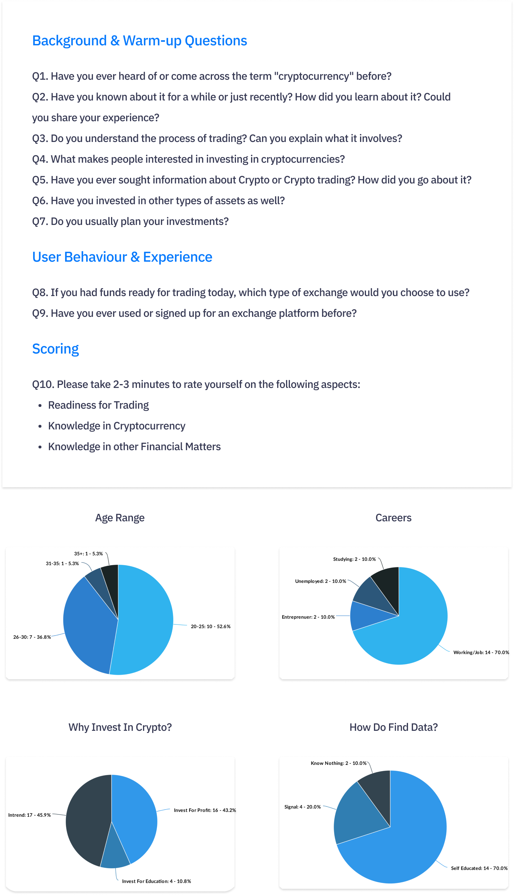
- Primarily interested in investing for profit generation.
- Prefers to gather information independently through social media channels.
- Prefers using Dark Mode over Light Mode due to its eye-friendly qualities for extended periods.
- Mostly novice investors without much experience in the field.
- Have used other trading platforms but disliked them due to their lack of reliability.
- Takes a long time to decide on investments as there's no Demo Trade feature.
- Lacks understanding of how to start trading due to scattered internet knowledge without clear step-by-step guidelines.
- Prefers Dollar-Cost Averaging (DCA) trading strategy for lower risk exposure.
- Gets bored easily with the current app's unappealing design, as it lacks aesthetics and mainly consists of text.
I conducted interviews with a total of 20 individuals who have been involved in the cryptocurrency industry, comprising both newcomers and experienced participants. This group was gathered through discussions with the Marketing team, aiming to target them through Facebook Ads. The participants were divided into two groups: 10 individuals who are new to trading, and another 10 who have previous trading experience.
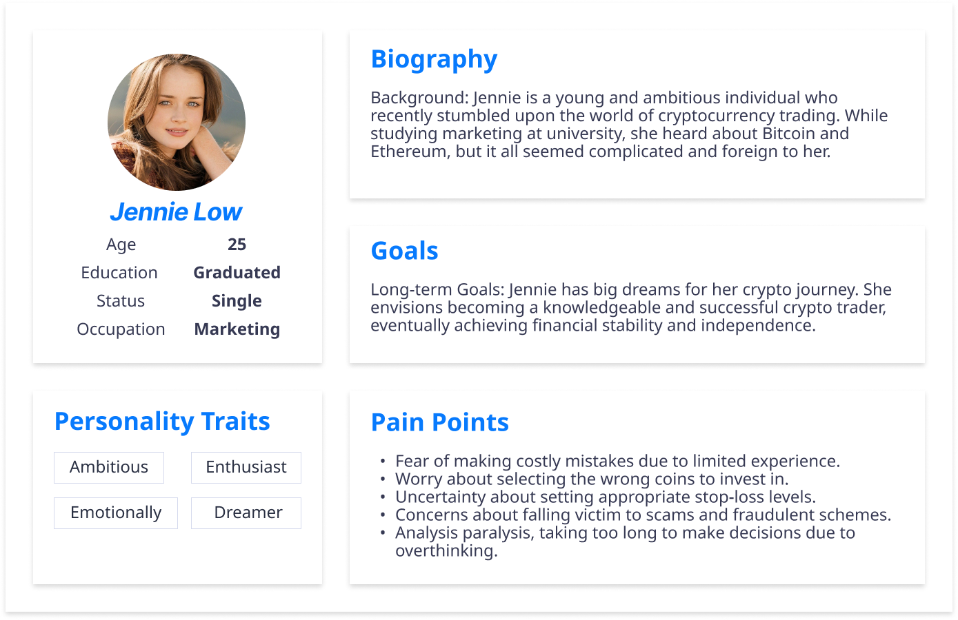
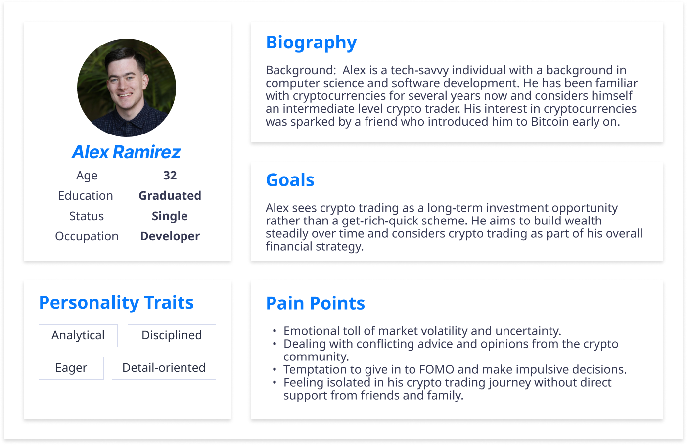
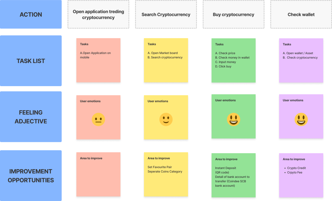
For the User Journey aspect, I have divided the scenarios into separate case studies for each User Persona. Each scenario focuses on the steps involved in initiating the usage of the cryptocurrency exchange application. The goal is to generate user flow ideation, aiding the implementation of the design by identifying any gaps in the journey's stages.
Lily Johnson (Beginner) I want quickly buy cryptocurrency, as one of my friend talk about specific crypto
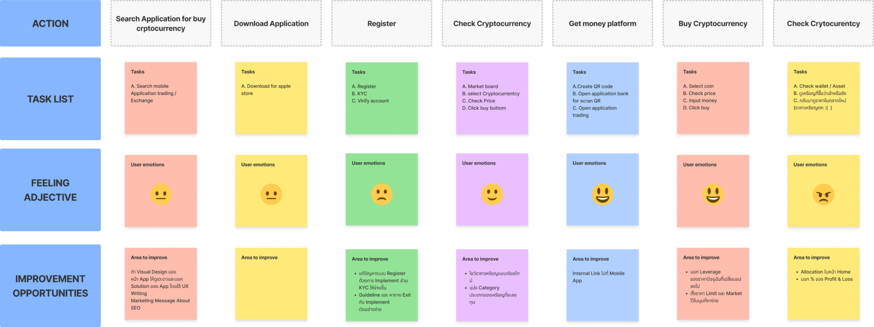
Alex Ramirez (Intermidiate) I want to look at graph of the specific crypto bought
I have gathered requirements from team discussions through the use of Easter eggs and discussions held throughout the day. This was done to gather diverse opinions, which will help determine the features through the design process. We started by discussing the user flow roughly, allowing us to visualize the user's trading process from the beginning to the end. We will then break this down into smaller sub-flows and continue the discussion.
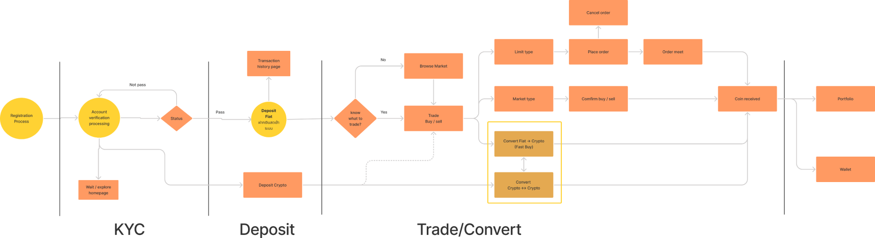
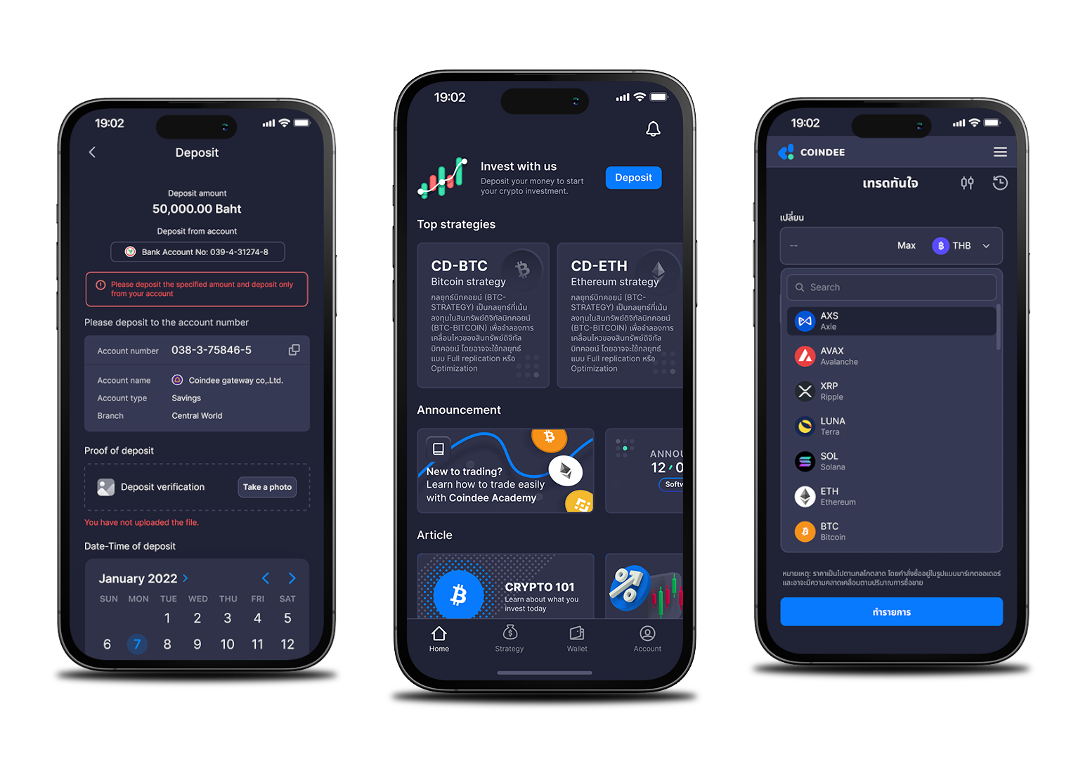
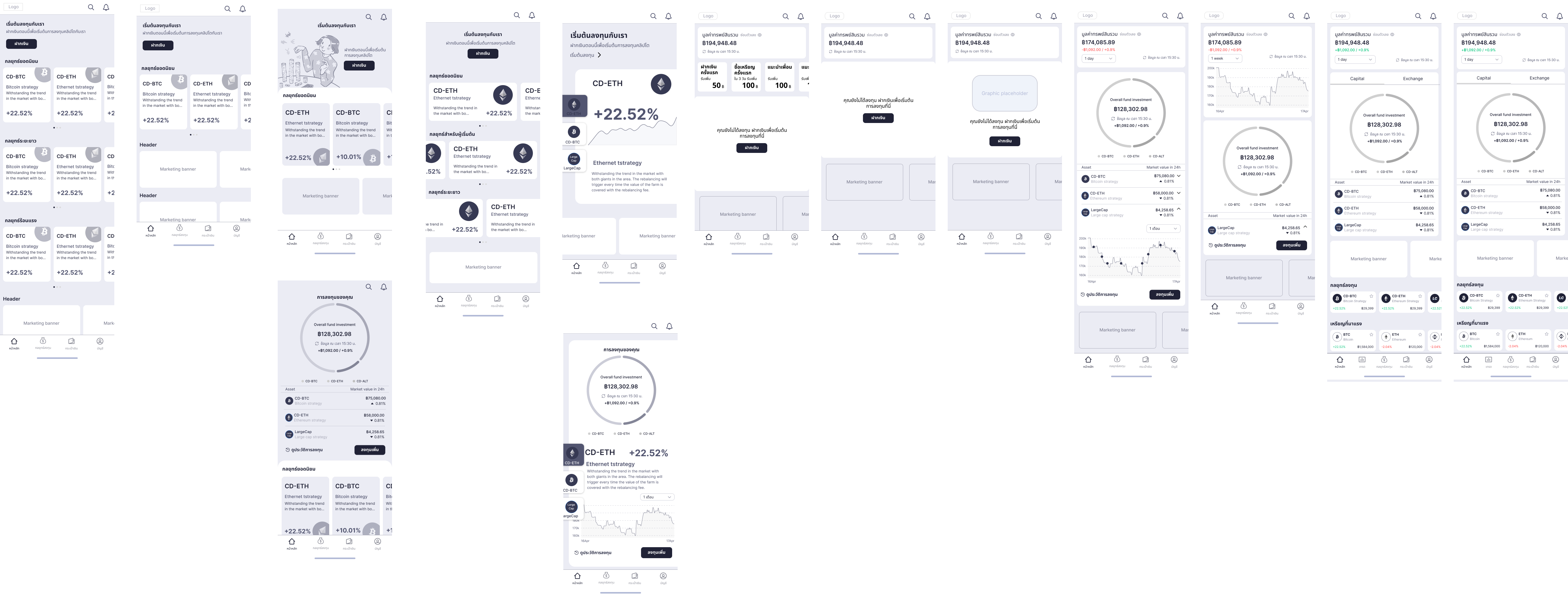
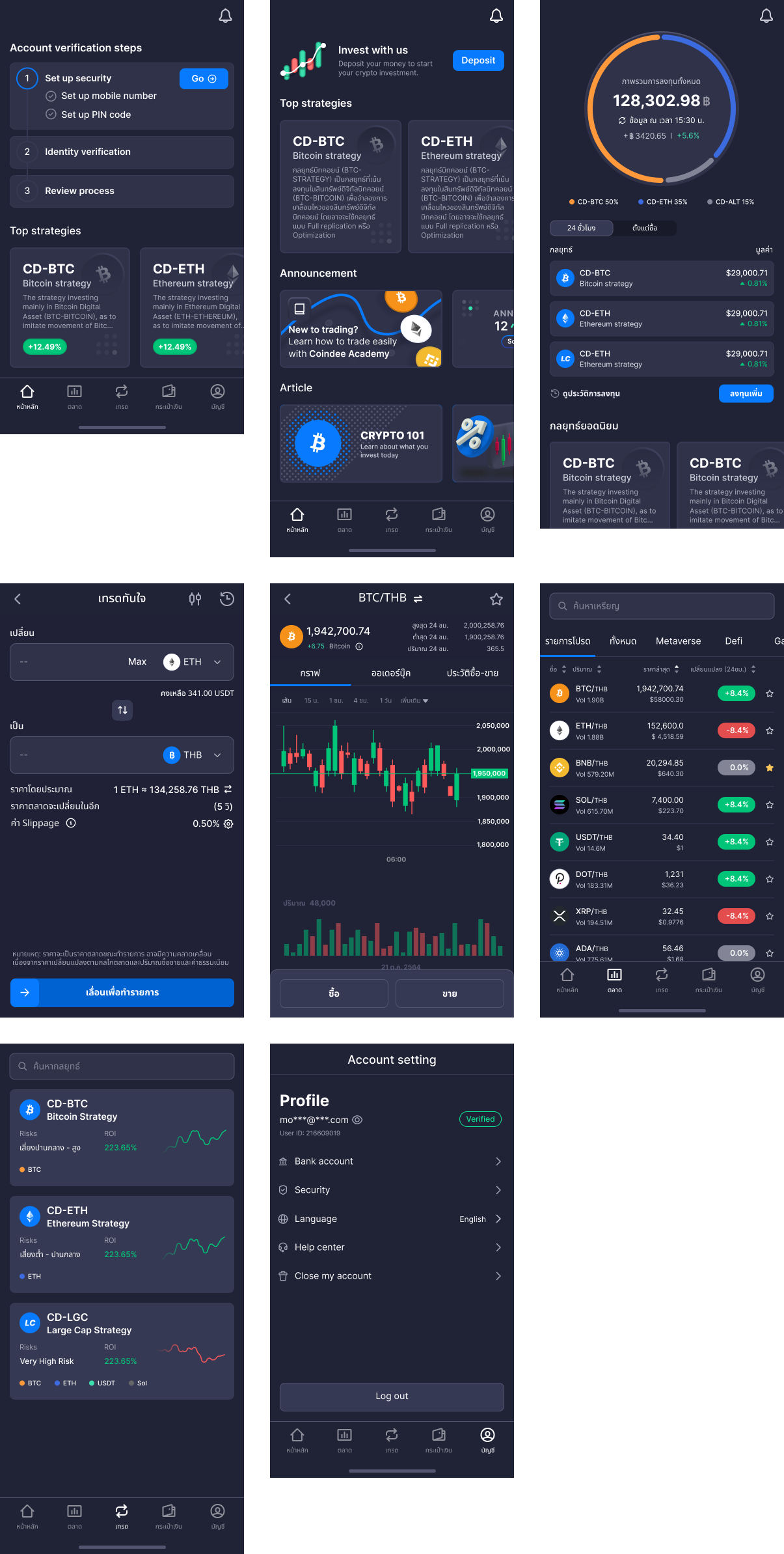
After summarizing the discussions about the features, we proceeded to design the information architecture based on the outlined flow. This involved breaking down the information into smaller components, starting from the home page, login, market section, deposit, verification, account settings, and so on.
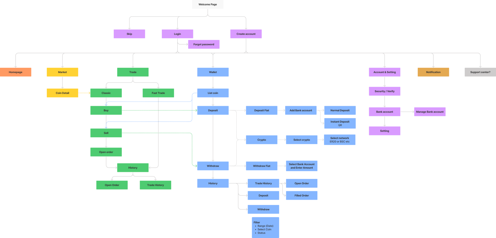
After obtaining the overall flow data that needs to be executed, we proceeded to break it down into task flows in order to distribute the tasks for each individual to work on. I was assigned the responsibility for this in the sections related to the home page and account settings.
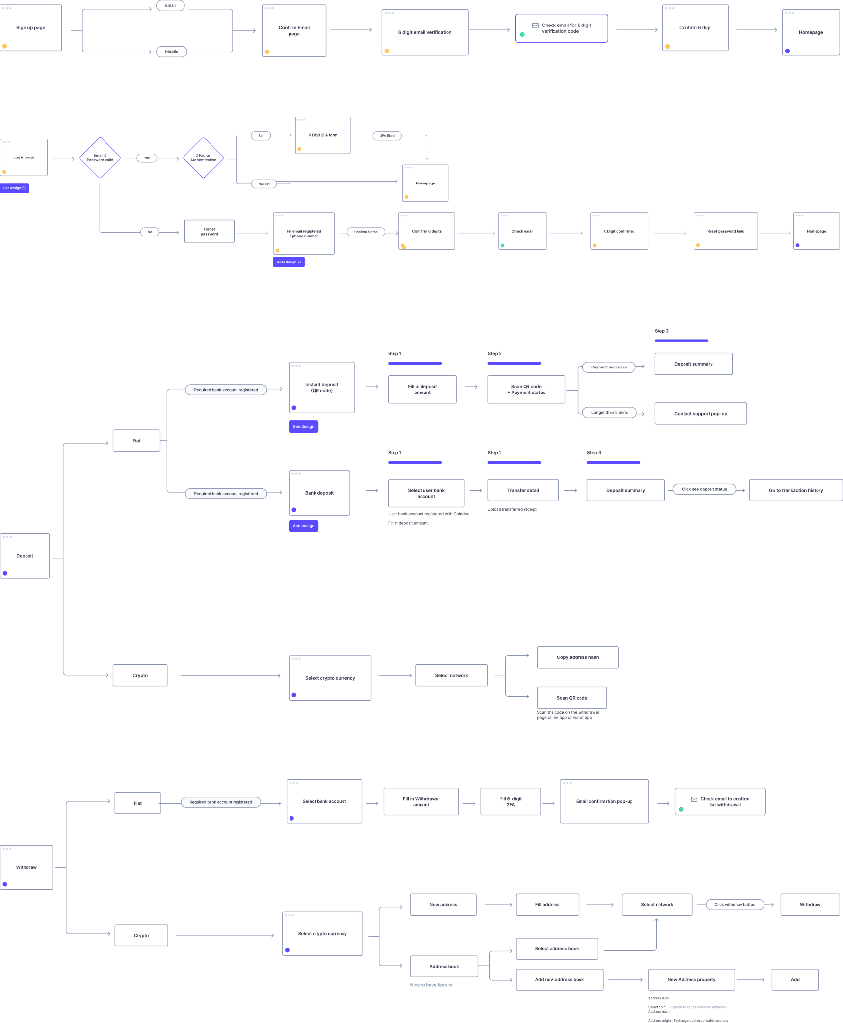
The team has designed mid-level wireframes to summarize the basic information, which will be used for further usability testing. This testing aims to analyze user interaction issues. The main problematic flows, mostly characterized by dynamic user interactions, are the home page and the classic trade page. These are the primary areas of focus for the team, as they are the most frequently used features by users.
The outcomes of this Usability Testing session were aimed at assessing user feedback on the initial version of the implementation for the Home and Classic Trade sections, as illustrated in the lower part of this Affinity Map.
%201.png)
4/5 of the users quickly grasp how to use the Home page.
5/5 of the users enjoy viewing the post-purchase coin Allocation graph.
5/5 of the users understand how Profit & Loss is presented.
2/5 of the users do not understand what DCA (Dollar-Cost Averaging) means.
The display of assets may need to include information about how this data is presented, such as within a 24-hour timeframe.
Users would appreciate a clear and distinct breakdown of details for the different colored sections in the Allocation view.
Users have inquiries about how historical data will be presented and organized for easy comprehension.
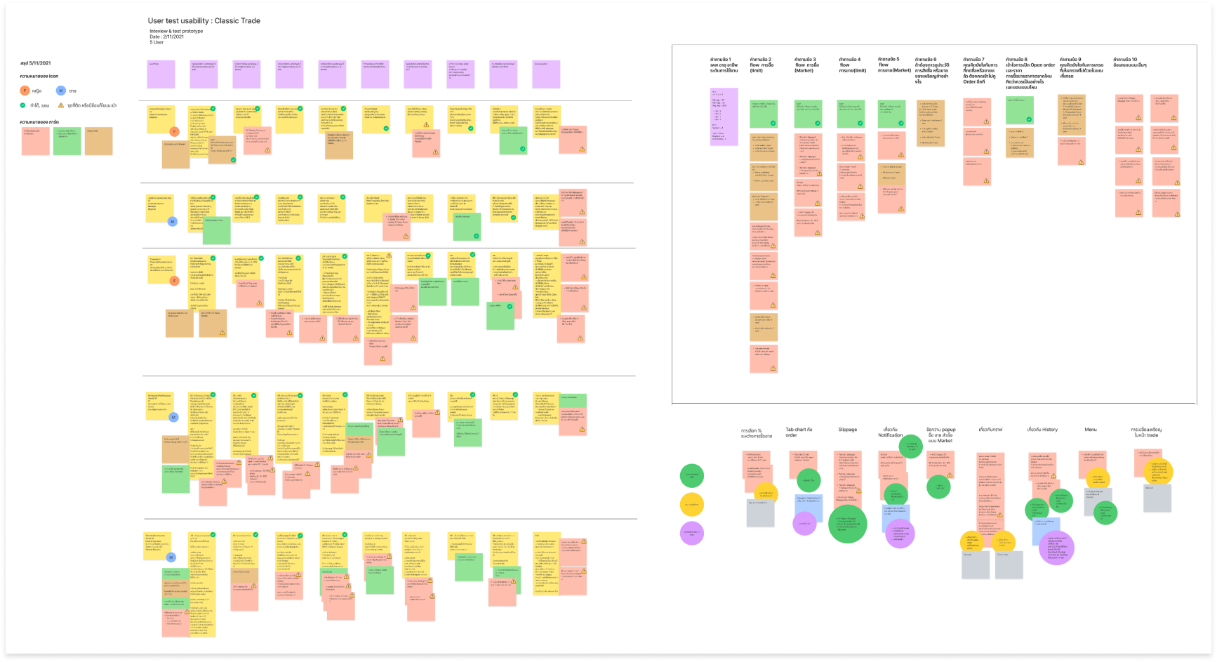
5/5 of the users prefer inputting numerical values over selecting percentages.
5/5 of the users wish to have information about opening and trading data integrated into the same page as the Indicators section.
4/5 of the users like the ability to review the trade history for observing the Average Profit.
2/5 of the users emphasize the significance of considering Slippage before making trading decisions.
It would be great to include more than 4 options for percentages, in case users want to add a custom value. If not available, users should be able to input the percentage manually.
A prominent popup for Slippage should be added for better visibility, as it often goes unnoticed.
Considering the ability to view order details on the graph page would be beneficial. This way, users can easily cancel or adjust orders when they see changes in the graph.
Purchasing at times might not consolidate into a single total. In the trade history, providing details about divided transactions could be helpful, as some orders might be completed while others are still processing.
- As with any project, there were some things that worked well and others that didn't.
- One of my biggest learnings from this project was that how well a team works together really makes or breaks a project.
- Being able to explore without getting attached to a particular design was very helpful for us to think objectively.
- to rationalize every design decision by solid research that minimizes gaps.
- the last but not the least thing I learned was a genuine interest in the work you’re doing will be the biggest motivation. Since our dev team was in India, we had to work at odd hours to accommodate the time difference but the team’s passion in this project was so motivating that we didn’t mind that schedule at all.
Design Implementation & Handoff
- Since the design has been tested and revised, it is ready to enter the development phase. In order to effectively communicate the design to developers, I redlined and organized my design deliverables using for handoff, and prepared to assist with any follow-up questions.
Maintenance
- Updates and revisions will continue to exist in the future, and I will address them based on the priority levels.

